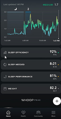
Based on a customer question after he upgraded to life subscription, he was not sure if it worked or not, as he saw no difference on the UI …makes a lot of sense his feedback..
@liv0 answered this one there and i informed her i was going to post here my suggestion:
Suggestion would be to add a simple UI improvement to each category of subscription the user has, one, peak, life..
to add a simple “one” , “peak” , “life” to the side or below the whoop name into the APP would be perfect, and maybe make the color of the background of the app a little bit different, matching the colors of the subscription.
if i was a user of LIFE for example that is much more expensive, i would like to feel that i am in a app(world) that it is exclusive for me, as i am more premium user.. similar to the experience credit card holders has, in airplane companies or credit cards…


